

Understanding Color Psychology
Color psychology is a fascinating field that explores how colors can influence human emotions and behaviors. Within the context of interior design, understanding this concept can significantly enhance the ambiance of a home. Every color has its unique associations, which can evoke various feelings and moods. By leveraging these associations, homeowners can create spaces that reflect their desired emotional environment.
For instance, warm colors such as red, orange, and yellow are often associated with energy, excitement, and warmth. These colors can be particularly effective in common areas like living rooms and kitchens, where social interaction is encouraged. However, it is essential to consider the intensity of the hue; for example, softer shades of these warm colors can create a welcoming atmosphere without overwhelming the senses.
Conversely, cool colors, including blue, green, and purple, tend to evoke calmness and serenity. These shades are ideal for bedrooms or bathrooms, where relaxation is a priority. A soft blue can create a tranquil space conducive to rest, while a gentle green can enhance feelings of nature and renewal.
Neutral colors, such as beige, gray, and white, serve as a versatile backdrop that complements more vibrant hues. These colors can promote a sense of spaciousness and simplicity, making them suitable for any room where flexibility in design is key. Additionally, incorporating various textures and materials can further enrich the neutral palette while maintaining a harmonious balance.
Understanding the emotional impact of colors enables homeowners to make informed choices that align with the desired atmosphere of each space. By thoughtfully selecting paint colors based on their psychological effects, one can curate a home environment that supports well-being and enhances daily life.
Assessing Your Space
Choosing the right paint colors for your home begins with a thorough assessment of your space. Understanding the various elements of a room can significantly influence not just your color choices, but also the overall aesthetic of your home. Start by evaluating the size of the room. Larger spaces may benefit from deeper or bolder hues, while smaller areas can feel cozier and more inviting with lighter shades. Consider how the layout affects the flow of the room, as open floor plans might require a cohesive color scheme that ties in various areas.
Another crucial factor to weigh is the lighting in the room. Observe your space at different times throughout the day, as natural light can dramatically alter how paint colors appear. For instance, a color that looks warm in the morning light may appear cooler later in the day. Additionally, consider the impact of artificial lighting; different types of light bulbs can emphasize certain tones in your paint choice. Conducting these observations during various times will provide you with a comprehensive understanding of how light interacts with potential color options.
Furthermore, your existing furnishings should play a key role in your color assessment. Take inventory of your furniture, artwork, and decor. The color palette you choose should complement these elements to create a cohesive design. If your furniture features bold colors, you may want to select more neutral wall shades. Conversely, if your furnishings are muted, consider using brighter wall colors to enliven the space. Ultimately, a careful evaluation of room size, layout, lighting, and current decor will equip you with the insight needed to make informed paint selections for each area of your home.
Creating a Color Palette
Choosing the right paint colors for your home begins with creating a cohesive color palette that reflects your personal style while also establishing a harmonious atmosphere. The first step in this process is to select a primary color that will serve as the foundation for your color scheme. This primary color will typically be used for larger areas, such as walls, and should evoke the mood you want for the space. Consider colors that align with the function of the room; for example, soft blues or greens can create a tranquil atmosphere in a bedroom, while warm yellows or oranges might invigorate a kitchen.
Once the primary color is chosen, it is essential to select accent colors that can complement this main hue. Accent colors can be used for trim, smaller furniture pieces, or decor items. To ensure a polished look, choose colors that harmonize with your primary color. Utilizing a color wheel can be particularly helpful in this regard. Colors that are located next to each other on the wheel, known as analogous colors, can provide a serene and cohesive look. Alternatively, selecting colors that are directly opposite on the wheel, referred to as complementary colors, will create more dynamic and vivid contrasts.
Moreover, consider incorporating a range of shades and tones within your palette to add depth. This approach can help in achieving a balanced and visually appealing environment. For instance, if your primary color is a light blue, using a darker navy as an accent alongside a soft sky blue can enrich the overall look. As you finalize your color palette, test paint samples on your walls to see how they interact with the lighting and existing furnishings, allowing for adjustments that ensure ultimate satisfaction with the selected hues.
Sample Testing and Swatching
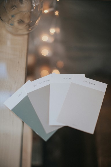
When selecting paint colors for your home, one of the most crucial steps is sample testing and swatching. Paint colors can look drastically different depending on lighting conditions, the size of the room, and the surrounding decor. Therefore, it is beneficial to start your process with a few sample pots of paint in colors that interest you.
To conduct an effective test, select a small area on your wall to apply the samples. It is advisable to paint a patch that is at least two feet square. This will enable you to see how the color interacts with the existing elements in the room, such as furniture and flooring. Ideally, paint swatches in multiple locations within the space to observe how the color changes under varying light scenarios, such as during both day and night.
After applying the patch, allow the paint to dry completely before making a judgment on its suitability. Wet paint can appear darker and may not accurately reflect the final color. Once dried, observe the shade at different times throughout the day since sunlight can shift in hue and brightness, affecting how the color appears. Use natural and artificial light conditions to truly gauge the paint’s adaptability.
In addition to checking in various lights, consider how the chosen paint color will pair with neighboring rooms or hallways. If your home has an open floor plan, ensure that the colors complement each other to create a cohesive look. After evaluating different samples, compare your impressions and narrow down your final options before making a definitive choice. This thorough approach to sample testing and swatching can help ensure that the chosen paint reflects your desired aesthetic and enriches your living space.
Choosing paint colors for your home involves a careful consideration of current trends as well as timeless choices. While it can be appealing to embrace the latest color fads, one should also weigh the long-term implications of this decision. Trends in interior design are often driven by fashion influences, seasonal themes, and even cultural shifts. For instance, shades like warm neutrals and earthy tones have gained popularity recently, reflecting a broader movement towards sustainability and wellness.
On the other hand, timeless choices such as soft whites, muted grays, and pastels tend to transcend fleeting trends. These colors not only provide a classic backdrop for furnishings but can also enhance the overall ambiance of your home. By selecting a foundation of timeless paint colors, homeowners create a versatile canvas on which to layer seasonal accessories or trendy accent pieces.
It is essential to strike a balance between embracing current trends and opting for enduring palettes that reflect your personal style. To achieve this, consider incorporating trendy colors in smaller areas, such as accent walls, cabinetry, or decorative items. This method allows for a fresh, contemporary feel without overwhelming the space. For example, a bold cerulean blue or a rich terracotta can invigorate a room when used thoughtfully, while the primary color scheme remains constant.
Moreover, when assessing current trends, pay attention to how they resonate with your home’s architecture and overall aesthetic. A modern home may benefit from different trendy colors compared to a traditional one. Ultimately, the choice of paint color should harmonize with your lifestyle and preferences, ensuring satisfaction for years to come. By blending components of both current trends and timeless choices, homeowners can create a visually appealing and enduring environment.
Understanding Sheen and Finish
When selecting paint colors for your home, it is crucial to understand the different types of paint finishes available, as they can greatly influence both the aesthetic appeal and practicality of a space. Paint finishes primarily range from flat (or matte) to high-gloss, each offering unique benefits suited to various environments within the home.
Matte finishes possess a non-reflective surface that can effectively mask imperfections on walls, making them ideal for low-traffic areas such as bedrooms and dining rooms. They provide a soft, elegant look and enhance the depth of painted colors, making them particularly favorable for creating a cozy atmosphere. However, their low durability means that they may not hold up well in areas that require frequent cleaning or exposure to moisture.
Satin finishes blend the best of both worlds by offering a slight sheen while still being relatively easy to clean. This makes them well-suited for medium-traffic spaces like hallways, living rooms, and children’s rooms. The subtle luster adds dimension to color, enhancing the overall appearance of the painted surfaces.
On the other end of the spectrum, gloss and semi-gloss finishes are highly durable and reflective. These finishes are particularly beneficial in high-traffic areas and spaces exposed to moisture, such as kitchens and bathrooms. They resist stains and are simple to maintain, which is essential in areas where cleanliness is paramount. Moreover, the sheen they provide can create a contemporary and vibrant appearance, amplifying the brightness of colors used in a space.
Ultimately, the choice of paint finish can dramatically alter both the look and longevity of the paint in your home. By thoughtfully considering the specific requirements of each area, homeowners can make informed decisions that enhance the visual appeal and functionality of their living spaces.
Room by Room Color Suggestions
Choosing the right paint colors for each room in your home can significantly influence the ambiance and functionality of the space. Various rooms serve different purposes and evoke distinct moods, making color selection an essential aspect of home decoration.
Starting with the living room, a space often associated with relaxation and socialization, consider soft neutrals like beige or light gray. These colors create a welcoming atmosphere while allowing for flexibility in decor. To add a touch of character, consider accent walls painted in warm shades like terracotta or deep blue. These colors promote warmth and creativity, making the living area inviting for gatherings.
In the bedroom, where serenity and tranquility are desired, softer shades of blue or green work exceptionally well. Such colors have a calming effect, encouraging relaxation and rest. Light pastel shades or even muted earth tones like taupe can also create a peaceful environment, while darker colors like navy or charcoal offer a sense of coziness, promoting sleep.
The kitchen is a space for creativity and nourishment, and vibrant colors can stimulate appetite and energy. Consider cheerful yellows, pale greens, or even soft reds to invigorate the space. An alternative approach can involve using white or light gray for your main walls, creating a clean slate that can be complemented with colorful accents in kitchen accessories or furnishings.
Lastly, for bathrooms, where a refreshing and clean atmosphere is paramount, light blues or soft lavenders can turn a simple space into a spa-like retreat. Neutral tones like pale gray or crisp white can also lend a sense of cleanliness and spaciousness, enhancing the effects of natural light.
By thoughtfully selecting colors for each specific room, you can create a harmonious flow in your home that caters to its various functions and enhances overall mood.
Using Accessories and Decor to Enhance Color Choices
Choosing the right paint colors for your home is a significant aspect of interior design that can dramatically influence the ambiance and functionality of your space. However, the interplay between paint colors and decor elements is equally vital for achieving a cohesive look. Accessories and furniture can substantially enhance your chosen colors, creating visual interest and harmony throughout your home.
When selecting accessories, consider utilizing textiles such as rugs, curtains, and cushions that complement your paint colors. For example, if your walls are painted in a soft blue, incorporating cushions with patterns that feature varying shades of blue, whites, or even contrasting colors such as yellow or orange can create a balanced look. These complementary colors can evoke a sense of comfort while reinforcing your palette.
Artwork is another powerful tool in enhancing the aesthetic of your chosen paint colors. Selecting pieces that draw upon the hues in your wall colors can unify the space. For instance, a painting with earthy tones can bring warmth to a room with sage green walls. This not only enhances visual interest but also ties the decor together, offering a sense of cohesion.
Additionally, the choice of furniture should align with your color scheme. Neutral-colored furniture can serve as a versatile base across various paint colors, while bold-colored pieces can serve as statement items that highlight your chosen hues. By strategically placing these furniture pieces in relation to your wall colors, you can create areas of focus that guide the overall aesthetic direction of the room.
Ultimately, the thoughtful integration of accessories, textiles, and furniture colors with your wall paint choices enables the creation of inviting and harmonized living spaces. Crafting this balance requires an understanding of color theory, personal style, and the desired emotional responses you aim to elicit within your home environment.
Final Thoughts and Next Steps
Choosing the right paint colors for your home is a pivotal decision that can significantly influence the atmosphere and aesthetic appeal of your living spaces. Throughout this blog post, we have explored various factors that should be considered during this process. Understanding how light interacts with colors, the emotional impacts of different hues, and the importance of testing samples can radically enhance the final results of your painting project.
Additionally, we discussed the significance of harmony within your interiors, which can be achieved by coordinating colors between rooms and considering existing furnishings. Remember that personal style plays a crucial role; your home should reflect your tastes while also ensuring versatility for potential changes in decor over time.
As you prepare for your painting project, it is advisable to gather samples of your chosen colors and observe them in various lighting conditions throughout the day. This will help you make an informed decision, ensuring that the selected shades will bring your vision to life. Furthermore, do not hesitate to seek professional advice, as color consultants can provide valuable insights that align with your preferences and the architectural style of your home.
To confidently move forward, create a checklist of your goals: consider the purpose of each room, the mood you wish to convey, and any limiting factors such as existing features. Once you have finalized your color palette, proceed with purchasing your chosen paint and tools, keeping your strategy for application in mind.
In conclusion, the selection of paint colors can greatly enhance the liveability of your environment. By reflecting on the insights presented and taking actionable steps, you are well-equipped to embark on your painting journey with confidence and creativity.